A

Tuesday, February 22nd, 2022 8:25 AM

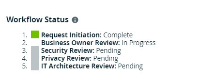
Workflow status progress bar

@jennifer_bauer_temple.baxter.com I’m continuing our discussion on workflow progress bar here, in order to not derail the previous post ( VotingSubProcess with Results Table - :bulb:Marketplace - The Data Citizens Community (collibra.com)). Well… better late than never!

I was very inspired by your visualization and I’ve implemented a progress bar I’m pretty happy with

For this, I have:

$default-line-colour: #ccc;
$active-line-colour: #17323E;
$default-text-colour: #ccc;
$active-text-colour: #17323E;
$done-text-colour: #03755F;
  • Used the application greenshot (from microsoft store) to take 8 screenshots for each step with exactly the same size
  • Uploaded the images to the community where the workflow is used and configured the attachment IDs in the start form of the workflow
  • Each step of the workflow sets the “workflow status” to something like "<img src=\"/rest/2.0/attachments/${wfStatus6Feedback}/file\" alt=\"Requester Feedback\"/>".toString() or delete the attribute when exiting.

The result is in my opinion really really nice, quite easy to do over and over again.

I would have preferred to use customization files, but it’s such a pain to manage (need to backup, restart the environment, etc.) that I chose for attachments instead.
The attached files are not retrieved from the migration utility (too bad…) which means it will require some manipulation to migrate to another environment.

I can’t wait for a proper customization functionality to be delivered, in order to upload files without having to restart DGC and to be included in the migration files.

148 Messages

 • 

60 Points

2 years ago

Impressive (and creative ;))! I’ve shared this with the Workflow team.

2 years ago

This is brilliant. A great solution to enhance user experience

6 Messages

2 years ago

Also very nice example we have in marketplace in Packaged Solution for Trusted Business Reporting.

image

<html>
<head>
    <title>Step progress bar</title>
    <style type="text/css">
        .form-help {
            margin-top: 15px;
        }
        .modalwindow.ui-dialog .ui-dialog-titlebar .subsection .subtitle {
            display: none;
        }
        .modalwindow.ui-dialog .ui-dialog-titlebar .subsection {
            display: none;
        }
        .container {
            width: 100%;
            margin: 5% auto;
        }
        .progressbar {
            counter-reset: step;
            width: 100%;
            background-color: #ffffff;
        }
        .progressbar li {
            list-style-type: none;
            width: 17%;
            float: left;
            font-size: 12px;
            position: relative;
            text-align: center;
            text-transform: uppercase;
            color: #a8a8a8;
        }
        .progressbar li:before {
            width: 30px;
            height: 30px;
            content: counter(step);
            counter-increment: step;
            line-height: 26px;
            border: 2px solid #a8a8a8;
            display: block;
            text-align: center;
            margin: 0 auto 10px auto;
            border-radius: 50%;
            background-color: white;
        }
        .progressbar li:after {
            width: 100%;
            height: 2px;
            content: "";
            position: absolute;
            background-color: #a8a8a8;
            top: 15px;
            left: -50%;
            z-index: -1;
        }
        .progressbar li:first-child:after {
            content: none;
        }
        .progressbar li.active {
            color: #002b40;
        }
        .progressbar li.active:before {
            border-color: #002b40;
            background-color: #002b40;
            color: white;
        }
        .progressbar li.active + li:after {
            background-color: #002b40;
        }
        .progressbar li.failed {
            color: #ff0000;
        }
        .progressbar li.failed:before {
            border-color: #ff0000;
            background-color: #ff0000;
            color: white;
        }
        .progressbar li.failed + li:after {
            background-color: #ff0000;
        }
        .progressbar li.selected {
            color: #72bf00;
            text-decoration: underline;
        }
        .progressbar li.selected:before {
            border-color: #72bf00;
            background-color: #72bf00;
            color: white;
        }
        .progressbar li.selected + li:after {
            background-color: #72bf00;
        }
    </style>
</head>
<body>
    <div class="container">
        <ul class="progressbar">
            <li class="'+ownerShipStatus+'">Confirm Ownership</li>
            <li class="'+descriptionStatus+'">Confirm Description</li>
            <li class="'+metricsStatus+'">Confirm Metrics</li>
            <li class="'+columnsStatus+'">Confirm Lineage</li>
            <li class="'+dqStatus+'">Confirm Data Quality</li>
        </ul>
    </div>
</body>

1.2K Messages

Nice one! I knew about the guided stewardship but not this one.
I find it very sad that it is not possible to use <style> tags in text attributes. This prevents any use case with this type of html elements, and that’s the reason why I used images instead of HTML in the attributes.

If anyone is interested, you can vote here to bring <style> tags back!
Support <style> tag in text attributes | Ideation Platform – Collibra | Product Resource Center

45 Messages

2 years ago

@arthur.burkhardt, I am happy that I was a source of inspiration to you, and that you were able to take my bubble gum and toothpick solution and create something more robust! One works with the tools they have, but I hope this shows others the art of the possible - from low tech to high :rofl:
workflowstatus

Loading...